

Next: Conclusions
Up: Correlation between notifications and
Previous: Correlation in the amount
We now look at the question whether users are interested in a similar set of
content categories across the two services. To answer this we take the following
approach: first, we classify notification messages and browsing accesses into different
categories. (The details of categorizing notifications are described in
Section 4.2, and the details of categorizing browse
accesses are described in our earlier work [1].) Then for each
individual user, we pick the top N content categories in browsing and top
N content categories in notification (if the next few categories after the
Nth category have the same frequency of access as the Nth category,
we include those categories as well for the top N case).
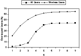
Figure 20 shows the percentage of users who have at
least some overlap between their top N browse and notification
categories. The degree of overlap is much higher when we consider
wireless users only. For example, for the top 3 categories,
the percentage of overlapped users is less than 10% when considering all the
users, and around 50% when considering only the wireless users. On the other
hand, even when considering wireless users only, the number of overlapped users
is never more than 65%.
Figure 20:
Number of users who have overlap between their top N browsing categories and top N notification categories.
 |
We now compare the extent of the overlap by varying N from 1 to the total
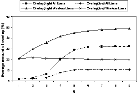
number of categories. The results are shown in Figure 21. The figure shows the average percentage of overlap between two categories, where the average overlap is computed as follows:
where BC denotes the number of browse categories, NC denotes the number of
notification categories, and relevant users refers to those users that have at
least one browse record and one notification record in the respective logs. We show the results for only the top 9 categories, since the values beyond that are stable.
Figure 21:
Correlation between the number of browse requests and notifications of wireless users.
 |
Essentially these ratios compute the percentage of overlap for each
individual user, and then take the average of these percentages over all
wireless users or all users. Since not all users have at least N browsing or
notification categories, we compute
overlaphigh and
overlaplow,
where the former computes the percentage of overlap by using the minimum of
BC and NC, and the latter uses the maximum of BC and NC. The figure
shows that the amount of overlap is considerably higher when considering only
wireless users. For example, for the top three categories, the
overlap is less than 7% when considering all users. In comparison, for
wireless users, the
overlaplow and
overlaphigh values are 21% and
36%, respectively. We also observe that the effect of increasing N is small.
Even when N is 8, the percentage of overlap is less than 50% for wireless
users.
The above results indicate that wireless users have moderate correlation in
the way they use browse and notification services. In comparison, the
correlation is much lower when considering all users. This is because the most
popular browsing categories for desktop users are sign-up services, direction,
and general help, whereas notification is usually not used to deliver these
types of content. On the other hand, some wireless users are interested in
both browsing and receiving notifications about emails, stock quotes,
personalization, news and sports. However, the degree of correlation is
limited, and service providers cannot solely rely on a user's notification
profile to determine what content he/she may be interested in browsing.


Next: Conclusions
Up: Correlation between notifications and
Previous: Correlation in the amount
Lili Qiu
2002-04-17


