Though poster-sized versions of this map were quite beautiful (and quite popular), they did not really meet our original visualization goals. The middle was a mess, and it did not look like we could iterate our way out of it, so the resulting map was not particularly useful.
 |
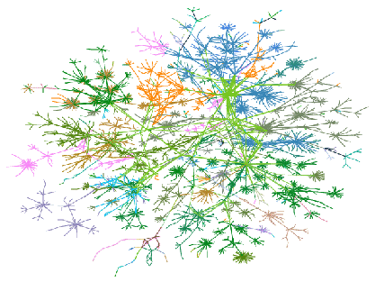
When we computed and plotted a minimum distance spanning tree (which we will define as a spanning tree of the original graph such that the distance from the root is preserved), the picture became much clearer. This is a cheat in one sense: our packets do not always take the shortest path. But the clutter in the middle cleaned up nicely (see figure 2).
If we consider only one shortest path to each destination, our graph turns into a tree, and the layout program can produce a much neater drawing. Alternatively, we could have used a graphing algorithm designed to lay out trees of arbitrary size [7], which tend to be faster than the general algorithms. Many of the tree drawing algorithms, however, result in unappealing drawings, due to two features of the resulting tree: the shallow nodes have very high degree (over 100, in some cases) and deep nodes have very low degree. Most of the standard algorithms work well for trees with relatively low degree trees (around two to ten).
Running our layout heuristic on the tree results in a very different map. The muddle in the middle is gone. The map looks less like a neuron and more like a coral fan or a space-filling curve. We can now trace individual paths from our host to most destinations. The cw.net backbone is still spectacular, and still somewhat muddled.
We lose about 5% of the edges of the graph when we throw away this inconvenient data. The edges still show interesting communities, but we can see much more now. By eliminating a number of inconvenient edges, we can make the map more useful, and traceable by the eye.
Now we can add those missing edges back in the background, drawing them in an unobtrusive color, such as light cyan. In some cases, the alternate routes show up nicely. In others, the muddle is back, but out of harm's way. Some nodes attract a number of redundant connections, which the eye can pick out easily.
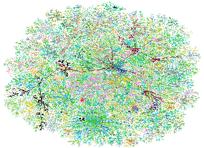
What works fairly well for the Internet works wonderfully for Lucent's intranet. That network has ``only'' 3,000 announced networks (versus some 90,000 registered for the Internet at this writing.) The full map is shown in figure 3.